
Essential Charts for Data Visualization

Data visualization is more than just making numbers look pretty—it’s about telling a story with data. Choosing the right chart can make the difference between confusion and clarity. Below, we’ll look at the most essential charts grouped by purpose: composition, comparison, relationship, and distribution. For each type, I’ll explain the theory, show where it shines, and share real-world examples.
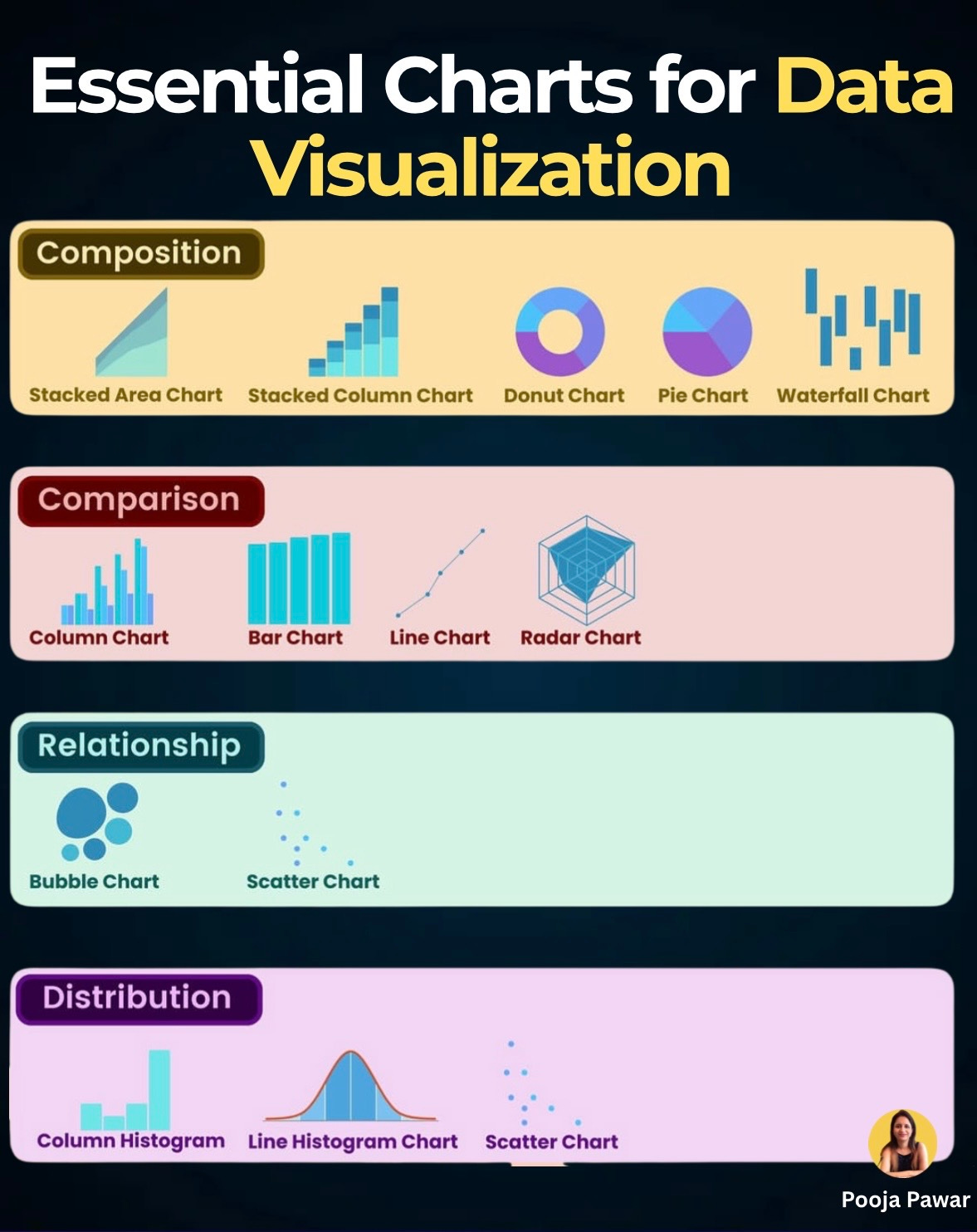
1. Composition: Showing Parts of a Whole
Why use it?
Composition charts answer questions like: How much does each component contribute to the total? or How does the mix change over time?
Charts to know:
Stacked Area Chart – Best for showing how multiple variables change together over time. Example: tracking website traffic sources (organic, paid, referral) over a year.
Stacked Column Chart – Useful for comparing totals and components side by side. Example: monthly sales broken down by product category.
Donut Chart & Pie Chart – Simple way to show percentages, like market share. Tip: keep categories under 5 to avoid clutter.
Waterfall Chart – Perfect for showing step-by-step changes, like how revenue starts at $1M and ends at $650K after costs, discounts, and taxes.
Fact: A Deloitte study found that executives interpret composition charts 40% faster than reading tables with percentages.
2. Comparison: Highlighting Differences
Why use it?
Comparison charts are ideal when you want to answer: Which is bigger, faster, or growing more?
Charts to know:
Column Chart & Bar Chart – Classics for comparing quantities. For instance, comparing quarterly sales across regions.
Line Chart – Best for showing trends over time, like monthly active users or inflation rates.
Radar Chart – Great for comparing profiles across multiple dimensions. Example: evaluating athletes’ performance in speed, stamina, strength, and accuracy.
Example: Spotify uses line charts to analyze user engagement over time, while marketing teams rely on bar charts to quickly compare ad spend across platforms.
Tip: If you’re showing growth, line charts emphasize trends; if you’re comparing categories, bar/column charts work better.
3. Relationship: Finding Connections
Why use it?
These charts answer: Do two variables move together? Is there a correlation?
Charts to know:
Scatter Chart – Shows individual data points to identify relationships. Example: plotting hours studied vs exam scores to see if there’s a correlation.
Bubble Chart – Adds a third dimension with bubble size. For instance, plotting countries by GDP (x-axis), life expectancy (y-axis), and population (bubble size).
Latest update: In the era of AI, scatter charts are increasingly paired with regression lines and clustering techniques to highlight hidden relationships in datasets.
4. Distribution: Understanding Spread
Why use it?
Distribution charts answer: How is my data spread out? Is it symmetrical, skewed, or concentrated in one place?
Charts to know:
Column Histogram – Shows frequency distribution, like exam score ranges for students.
Line Histogram (Density Plot) – Smoother version, often used in statistics to visualize probability. Example: distribution of salaries in a company.
Scatter Chart (again) – Can also reveal distribution when plotted across two dimensions.
Example: Recruiters use histograms to understand salary bands when creating competitive offers. Healthcare analysts use them to see the spread of patient ages across hospitals.
Tip: Always label bins clearly in histograms—misleading bin sizes can distort interpretation.
Charts are not just tools—they’re bridges between data and decision-making. The right chart doesn’t just display information; it changes how people understand it.
When presenting your next dataset, ask yourself:
Do I want to show parts of a whole (composition)?
Do I want to compare categories or time periods?
Do I want to highlight a relationship between variables?
Do I need to explain the distribution of my data?
Once you answer that, the chart practically chooses itself.
Always test your charts with a small audience before presenting them to stakeholders. If they grasp the message within seconds, you’ve chosen the right visualization.
Nice infographic! It's important to choose the best chart for your data.