
Excel Power Moves: Advanced Techniques to Supercharge Your Spreadsheets

Excel is more than just a tool for storing data—it’s a powerful analytical engine that can transform raw numbers into meaningful insights. Yet, many users only scratch the surface of its potential.
If you’ve ever spent hours manually sorting, filtering, and analyzing data, it’s time to leverage Pivot Tables, Slicers, and Advanced Conditional Formatting—three features that automate, streamline, and enhance data analysis.
In this article, we’ll break down these techniques with step-by-step instructions, real-world examples, practical tips, and the latest updates in Excel.

1. Pivot Tables: The Fastest Way to Analyze Large Datasets
A Pivot Table allows you to summarize and analyze large amounts of data in seconds without writing complex formulas. It helps you:
Summarize data by summing, counting, or averaging values
Group and categorize information dynamically
Compare trends across multiple categories
Rearrange data instantly without modifying the original dataset
How to Create a Pivot Table in 5 Simple Steps
Step 1: Select your dataset – Ensure your table has column headers and no blank rows
Step 2: Go to the “Insert” tab → Click “PivotTable”
Step 3: Choose where to place the Pivot Table – In a new worksheet or an existing one
Step 4: Drag fields into different Pivot Table areas:
• Rows: Groups data by categories (e.g., sales reps, regions)
• Columns: Creates separate sections for comparison (e.g., sales by year)
• Values: Applies calculations (e.g., sum of sales, average revenue)
• Filters: Allows dynamic filtering
Step 5: Customize the Pivot Table – Sort, filter, and format as needed
Example: Analyzing Monthly Sales Performance
Consider the following dataset:
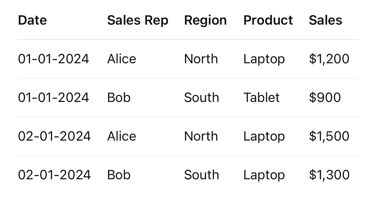
A Pivot Table can help you quickly find:
Total sales by region
Top-performing sales representatives
Best-selling products
Monthly revenue trends
Example: Calculating Total Sales per Product
Drag “Product” into the Rows area
Drag “Sales” into the Values area
Ensure the calculation is set to “Sum” (Right-click → “Summarize Values By” → “Sum”)
Tip: To see sales contributions as percentages, right-click the values → “Show Values As” → “% of Grand Total”
Latest Update: Pivot Table Enhancements in Excel
Excel 365 now includes “Recommended PivotTables,” which suggests automatic summaries based on your dataset. You can access it by clicking: Insert → Recommended PivotTables
2. Slicers: Interactive Filtering for Pivot Tables
A Slicer is an interactive filter that lets you visually segment data without using dropdowns or filter menus. It’s particularly useful for dashboards and reports where quick data manipulation is needed.
How to Add a Slicer to a Pivot Table
Step 1: Click anywhere inside the Pivot Table
Step 2: Go to “Insert” → “Slicer”
Step 3: Select the field(s) you want to filter (e.g., Region, Product, or Sales Rep)
Step 4: Click “OK” to insert the slicer
Step 5: Click a value inside the slicer to filter data dynamically
Example: Filtering Sales Data with a Slicer
If you have a Pivot Table summarizing sales figures, adding a Region Slicer allows you to filter the data instantly. Selecting “North” shows only the sales from that region; selecting “South” updates the report accordingly.
Tip: If you have multiple Pivot Tables using the same dataset, you can connect one slicer to all of them. Right-click the slicer → “Report Connections” → Select all Pivot Tables to link
Latest Update: Dynamic Array Slicers
Excel 365 now supports Slicers for non-Pivot Table data using Dynamic Arrays. This allows filtering in standard tables and formulas, not just Pivot Tables.
3. Advanced Conditional Formatting: Making Data Visually Insightful
Conditional Formatting automatically changes cell colors, fonts, or icons based on values, helping highlight trends and outliers. While basic rules exist, advanced formatting allows:
Formula-based formatting
Alternating row colors
Highlighting duplicate values
Dynamically changing text colors based on conditions
Example 1: Highlighting High Sales Values
To highlight sales greater than $1,000:
Select the “Sales” column → Conditional Formatting → Highlight Cell Rules → Greater Than → Enter 1000 → Choose a color → Click “OK”
Formula-based method: =B2>1000
This formula can be used under “New Rule” → “Use a formula to determine which cells to format”
Example 2: Alternating Row Colors for Better Readability
A striped-table effect can make large datasets easier to read. Use the following formula:
=MOD(ROW(),2)=0
Apply it under “New Rule” → “Use a formula to determine which cells to format”
Example 3: Color Coding Based on Text
To highlight all “High Priority” tasks in red:
=A2="High Priority"
Choose a red fill or bold font style to draw attention to urgent tasks
Example 4: Creating a Heatmap for Sales Performance
A heatmap visually distinguishes performance levels using gradient colors:
Select the “Sales” column → Conditional Formatting → Color Scales → Choose a scale (e.g., Green for high, Red for low)
Latest Update: AI-Powered Formatting Suggestions
Excel 365 now includes automatic suggestions for Conditional Formatting based on your dataset. Navigate to: Conditional Formatting → Manage Rules → Suggested Formatting
These advanced Excel techniques will help you analyze data faster, create interactive reports, and apply smart formatting with minimal effort.
Pivot Tables help you summarize and analyze data effortlessly.
Slicers enable quick filtering for dashboards and reports.
Advanced Conditional Formatting makes insights visually intuitive.
Start applying these features to your everyday Excel work and take advantage of the newest Excel 365 capabilities to work more efficiently and professionally.